How to create a powerful data science tool for machine learning
In this detailed tutorial, you will learn how to build an efficient tool for data analytics. This algorithm is easy to code and understand for people who do not have much experience in programming. It will be done entirely in Python, so this tutorial assumes that you have the latest version of Python installed on your device.
What is Regression?
In statistics, linear regression is a linear approach to modeling the relationship between a scalar response and one or more explanatory variables. Here, we will be analyzing the relationship between two variables using a few important libraries in Python. Below, you can see the equation for the slope of the line.
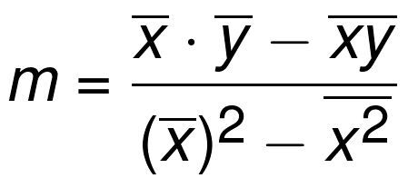
Although this does look complicated, you will soon understand that it’s a very simple equation. The horizontal lines that sit atop the ‘x’ and ‘y’ variables indicate the mean value. Basically, the lines above the ‘x’ value just means the average of all the ‘x’ values. We’ll get into that later.
Creating a dataset
We are going to need to create a data frame which our algorithm will analyze. The most simple thing to do is to use data from the internet. I used the Google stock data, which can be downloaded from https://finance.yahoo.com/quote/GOOG/history/. Make sure to save it as a .csv file so it can easily be imported.
Installing the libraries
There are three external libraries which are required – pandas, matplotlib and statistics. They can easily be installed by entering the following commands into you command prompt:
pip install pandas
pip install matplotlib
pip install statistics
Loading the libraries into Python
Open your Python IDE of choice and type the following:
import pandas as pd
from matplotlib import pyplot as plt
from statistics import mean
The necessary libraries have now been loaded in. The pandas library will allow us to open any .csv file and read data from it, the statistics library will let us mathematically operate on the data and we can plot our results using the matplotlib library.
Load the data into Python
df = pd.read_csv('/home/admin/Documents/GOOGLE.csv')
print(df)
Here, we have used pandas’ “read_csv” method to enter the data. The data frame is loaded into a new variable called “df” which we defined here. In the parentheses, enter the file path for your .csv file which was downloaded earlier in this tutorial. My file path is ‘home/admin/Documents/GOOGLE.csv’, but yours will probably be different. If there is any problem loading the data, use double forward slashes instead of single slashes to seperate the folders. If you run this segment of code, you should get an output like this:
           Date         Open         High  ...        Close    Adj Close   Volume
0    2018-11-01  1075.800049  1083.974976  ...  1070.000000  1070.000000  1482000
1    2018-11-02  1073.729980  1082.974976  ...  1057.790039  1057.790039  1839000
2    2018-11-05  1055.000000  1058.469971  ...  1040.089966  1040.089966  2441400
3    2018-11-06  1039.479980  1064.344971  ...  1055.810059  1055.810059  1233300
4    2018-11-07  1069.000000  1095.459961  ...  1093.390015  1093.390015  2058400
..          ...          ...          ...  ...          ...          ...      ...
246  2019-10-25  1251.030029  1269.599976  ...  1265.130005  1265.130005  1210100
247  2019-10-28  1275.449951  1299.310059  ...  1290.000000  1290.000000  2601500
248  2019-10-29  1276.229980  1281.589966  ...  1262.619995  1262.619995  1869200
249  2019-10-30  1252.969971  1269.359985  ...  1261.290039  1261.290039  1407700
250  2019-10-31  1261.280029  1267.670044  ...  1260.109985  1260.109985  1454700
Great! That worked. Let’s move on
In this tutorial, we will be looking at the relationship between the ‘Open’ stock prices in Google and the ‘Close’ stock prices. Since the Google stock isn’t volatile enough to have a big difference between the two, we will obtain a line with strong positive correlation. Now we can define our axes.
x = df["Open"]
y = df["Close"]
In this case, our X axis will be the column labelled “Open” and our Y axis will be the column labelled “Close” in our .csv spreadsheet.
The most important part – the regression
You remember that formula that we encountered earlier on which defined the slope of our line? Here’s a little reminder in case you forgot.
Now we need to explain this to our compilers, which is the hardest part of the tutorial. Here is where we can use our Statistics library.
def regressor(x,y):
    m = (((mean(x)*mean(y)) - mean(x*y)) /
         ((mean(x)*mean(x)) - mean(x*x)))
    b = mean(y) - m*mean(x)
    return m, b
This is slightly complicated to explain, but you can look at the formula and see that our code correctly corresponds to it. Using the “mean’ method from the library statistics, we managed to define our key variables – m, which is the gradient and b, which is the y-intercept. The toughest part is now behind us!
Defining another important variable
m, b = regressor(x,y)
print(m)
print(b)
regression_line = [(m*xs)+b for xs in x]
Here, we created objects for m and b based on our regressor function. We also defined the key variable, which is our line of regression. When this code is run, the output is:
0.9972320055158463
4.104195203671907
It worked! We now know our slope and y-intercept.
Graphing the line
plt.scatter(x,y)
plt.plot(x, regression_line)
plt.show()
Now we graph our results using the Matplotlib libarary. Our entire code up until now looks something like:
import pandas as pd
from matplotlib import pyplot as plt
from statistics import mean

df = pd.read_csv('/home/admin/Documents/GOOGLE.csv')
x = df["Open"]
y = df["Close"]

def regressor(x,y):
    m = (((mean(x)*mean(y)) - mean(x*y)) /
         ((mean(x)*mean(x)) - mean(x*x)))
    b = mean(y) - m*mean(x)
    return m, b

m, b = regressor(x,y)
print(m)
print(b)
regression_line = [(m*xs)+b for xs in x]

plt.scatter(x,y)
plt.plot(x, regression_line)
plt.show()
When the code is run, you get:

So it worked. We created an accurate, efficient linear regression algorithm. The same program can be used to model the relationship between any two variables. If you understood how this worked, congratulations. Regression is the essence of data science and statistics, and when it is combined with programming, you get a popular machine learning algorithm.
